Monday, 13 October 2014

Products, Audiences, Contexts


Books:
Cookbooks - students, men, women, mothers, working professionals 
Educational - students, teachers, parents
Parenting - parents
Fiction/story books - children/parents, teens/young adult, teachers

Students


Children

Parents

Teen

Elderly

Monday, 6 October 2014

Where am I now?

5 things I've learnt this year:

  1. Need to broaden my influences - look for and be inspired by people/artists I don't usually follow 
  2. Keeping a personal sketchbook to just draw whatever I want like my summer sketchbooks will really improve my drawing abilities
  3. To not be too precious with my drawings and get annoyed if it doesn't turn out the way I want it to
  4. And to use this to learn from my mistakes - repetitive drawing will also improve my drawing abilities
  5. Need to leave some time for me to enjoy my life outside of Uni - don't get too stressed out


5 things I want to know more about:

  1. How to get myself known/promote myself
  2. How to set up my own website
  3. The business side of things (e.g. prices etc.)
  4. What is expected of me to work within the industry
  5. If I want to work within the animation industry, how do I do that? what would I need?

My 5 strengths at this point in time:

  1. I put 100% effort into my work and quite good at managing my time effectively
  2. I am able to keep my work consistent with quality
  3. Familiarity with Photoshop
  4. I am quite good with my compositions and thumbnailing
  5. Drawing the human figure/characters

5 things I want to improve on:

  1. Being more experimental with media, tone of voice, production methods (e.g. screen print)
  2. Colour and lighting to create moods and atmospheres
  3. Drawing things (figures, objects, places) in different perspectives/angles
  4. Drawing backgrounds (different environments and settings)
  5. Making my illustrations more dynamic (e.g. how to capture movement in my illustrations - distorting, exaggerating shapes? etc.)

5 images that define where my interests are:

1. Children's book illustration:
2. Character design:
3. visual development/concept art:
4. Story boarding:
5. Stand alones/decor/art prints:

Monday, 15 September 2014

Indonesian Parenting Book Cover

My cousin is a writer in Indonesia and she asked me if I wanted to design the cover for her latest parenting book. It was a pretty much last minute thing but who would turn down an opportunity to do something like this?! The editor provided me with the title of the book and gave me a brief info on the book, some book cover examples from their existing books, the target market and the colours that they wanted me to use, which were pastel colours.

 They gave me 3 days to come up with 3 digitised ideas so I had to work super quick! Something I'm usually not good at:
The feedback I got was that they liked the 3rd design best but they said that there's already been a book with a similar design so they gave me another 2 days to come up with 3 more designs. Because they liked the 3rd design, I decided to employ the same kind of appearance (colours etc.) and playfulness to my next 3:
I wasn't really satisfied with any of these designs as I only had a few days to come up with something, I felt kind of rushed, which I feel it shows with these designs. But they got back to me anyways and said that they liked the first one. So with a few more adjustments I sent in a final:
A couple of weeks after, the book was all printed, packed and in bookstores:
I think I could've done way better if they'd given me more time to do this. But I guess this is all part of the experience which I am thankful for! plus I got paid too but hopefully I'll get more chance to do something like this in the future and apply myself even more to create something even better!

Monday, 26 May 2014

OUIL 402 End of Module Evaluation

By looking into the practices of other illustrators through Big Heads etc. this module, I have developed more of an understanding into what Illustration is, the industry and the different uses of illustration such as promotional uses, websites, publishing, products etc. Having tasks dedicated to time management this module have also developed my skill in time management.

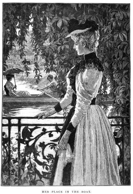
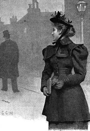
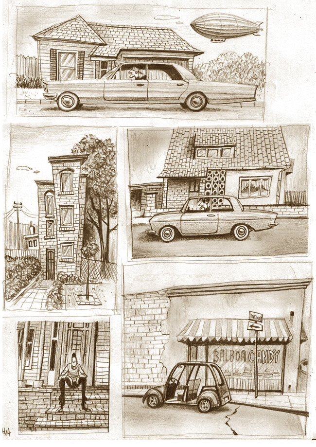
For studio brief 3, I have used a slightly different process to make my images. I really like the look my pencil sketches and the texture the pencil gave me. It sort of reminded me of the illustrations created in the Victorian era and I wanted this aesthetic reflected in my work as the research I did was based on things that happened during this era. Instead of going full on digital, I created each of my illustrations on paper first and then digitally enhanced them at the end. I found this a little time consuming but I really like the look this gave me - the texture, and the sort of roughness, raw, handcrafted feeling it gives my work. I also sort of wanted to redeem myself for not being as experimental and using different medias as I would've liked this year, so I’m quite glad I finally decided to do something a little different to my usual way of working for this brief.

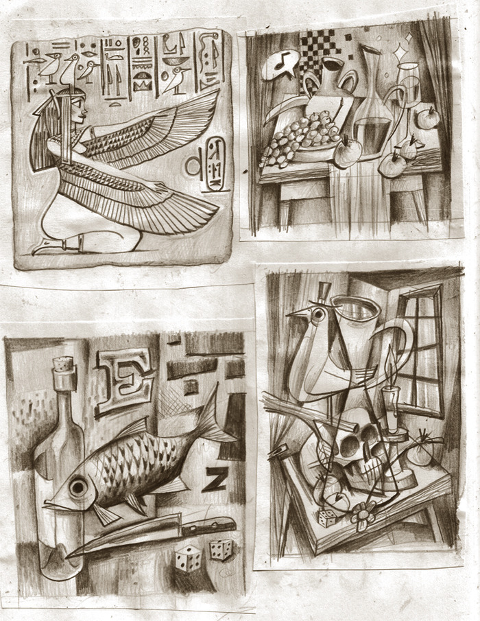
I wanted to sum up the kind of work that I’m interested in doing and the things that I’ve learnt this whole year through my work for studio brief 3. I think that my thinking, through thumbnailing is strength in this brief; I have started to think a lot more about my compositions, line of sight, depth, value, etc. in my work. Because of this I think I have been a bit more exhaustive with my ideas, sketching and planning which I've always wanted to try and improve on.

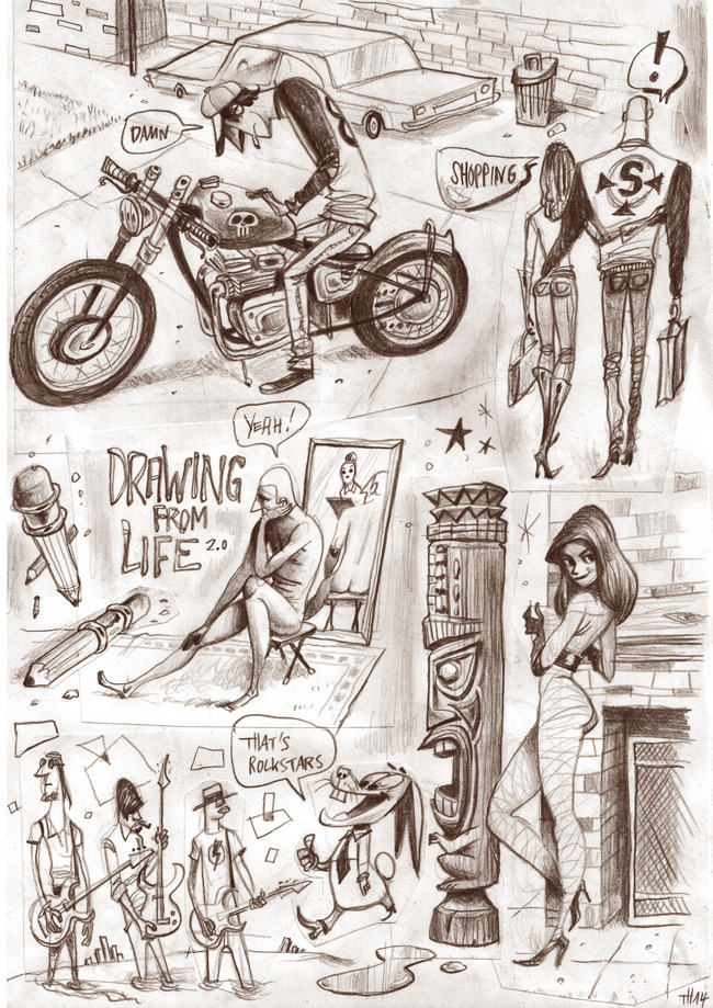
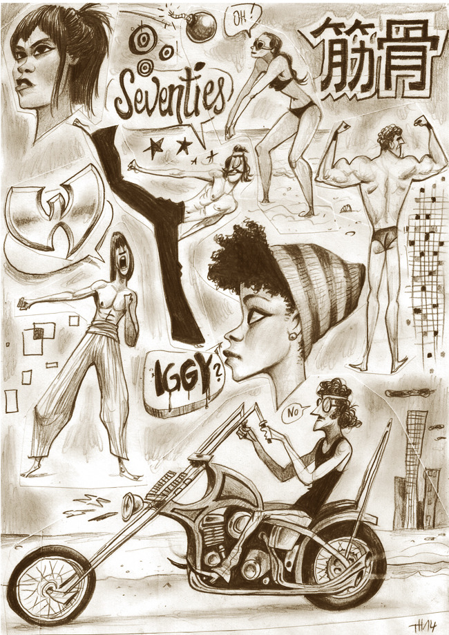
As well as the media play, I think I could have also explored more of other professionals work in this module - going out to see exhibitions, art events etc. I think this is the one main weakness of mine this module, which I think has affected my other work this year. I am a fan of a lot of artists and have a lot of people who inspires me with my work, but I've noticed that a lot of them are quite similar in what they do, their careers, their tone of voice, the media they use, how they use colour, texture and shape which I think is evident in the artists slide of my presentation. I think this is something that I need to work on during the summer and next year. I want to broaden my influences and look for people and be inspired by people who I don't usually follow, look through their ways of seeing the world and use this as a tool to find more to say with my own work. I want to take more risks and not be afraid to try new things and fail.

Saturday, 24 May 2014

Adjustments

For the crit, I didn't manage to make my work into a book format so just displayed the pieces that I've done in a row. I quite liked the look of my pieces displayed in this way, so I decided to write the name of the flowers and the meaning of them on each of the pieces instead, like so:

Printed them on nice paper, but the colour looks a bit more greyscale than how I wanted them to be.

Thursday, 22 May 2014

finals

After looking at all the pieces as a whole, I found that number 3 and 4 look quite similar. I want to change one of them but I don't think I have time to do that now. I quite liked working in this way, though I didn't realise it would take me such a long time to do. I think it's because I had to work almost fully in pencil first and then digitally enhance them - all the shading I think took a little too long than I would've liked. I think if I worked on an even smaller scale, I would've been able to complete them sooner, but then I don't think I'd be able to get a lot of the smaller details. I would like to try this out again for other projects in the future where the time isn't as strict as this one. I am really pleased with the outcomes though, as they are a little bit different to my other work that I've done this year. I really like the colour tinted ones as they mimic the look of old photographs, which is really what I want as I want to make them a little vintage looking

Monday, 19 May 2014

What kind of aesthetic do I want?

To further reflect the time period that my story is set in, I am going to create my final illustrations like the ones below of illustrations created in the Victorian era - with a little bit of my twist to it, so not as realistic looking. I think this would also be a good way to practise value/tone.

I am going to use pencil to create my final illustrations - I would have liked to have experimented with other medias, however because it is nearing the deadline now I don't think it's wise to do so. Also, I like the texture pencil gave to some of my thumbnails - makes them look like the illustrations above. 

Thorsten Hasenkamm have also used pencil to do his sketches (below) and they look bloody brilliant! I love how he says they're just 'sketches' or thumbnails - they look like they could be finished pieces to me! I like how the shapes are pushed and exaggerated to make them look so much more active and alive! so much fun! His lines are organic, even the straight ones aren't perfectly straight. Natural strokes which I think gives it a real, nice handcrafted quality which I absolutely adore. I also like the colour tint he's added to his drawings - makes them a little warmer and nicer to look at. This might add a bit of a vintage effect - I might have to try add a colour tint like this too, if my final grayscale illustrations look a bit cold.